ochResponsiveImages

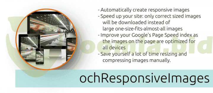
ochResponsiveImages - The Easiest Way to Optimize Your Images for All Devices Are you struggling to optimize your images for all devices? ochResponsiveImages is the solution you've been looking for. This powerful plugin automatically generates and serves optimized images for all devices, ensuring that your visitors only download the images they need. This can significantly improve your site's loading speed and performance, which are key factors in SEO.
ochResponsiveImages is also incredibly easy to use. Simply install the plugin and configure a set of breakpoints (sizes for the devices you want to support). For each breakpoint, an optimized image will be automatically generated and cached. Your original image will then be replaced with an HTML srcset containing all of the cached images.
When a visitor visits your site, their browser will automatically select the image from the srcset that is best suited for their device. This ensures that your visitors always see the highest quality image possible, regardless of the device they are using.
Benefits of ochResponsiveImages:
- Speed up your site: ochResponsiveImages can significantly improve your site's loading speed by serving optimized images for all devices.
- Improve your Google's Page Speed index: ochResponsiveImages optimized images are smaller and faster loading, which can lead to a significant improvement in your Google's Page Speed index. This can help you improve your search engine rankings and visibility.
- Save you a lot of time: ochResponsiveImages eliminates the need to manually resize and compress your images for different devices. This can save you a significant amount of time, especially if you have a large number of images on your site.
- Convert your images to WebP: ochResponsiveImages can automatically convert your images to the new WebP next-gen image format, which is supported by all major browsers. WebP images can be up to 30% smaller than JPEG images without any loss in quality.
- Automatically add decoding and width/height attributes: ochResponsiveImages automatically adds the necessary decoding and width/height attributes to your images, which can help to improve your site's performance and prevent CLS (Cumulative Layout Shift).
- Language support: ochResponsiveImages comes out of the box with support for multiple languages, including English, Polish, Serbian, and Turkish. You can also create or improve your own language translation on Transifex.
Get 50 Cents for every review you add.
