JA Wall - Responsive Grid
JA Wall - Responsive Grid v1.2.7
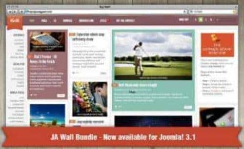
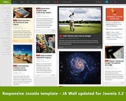
The JA Wall template is powered by a dynamic grid-style layout and the combination of jQuery Masonry plug-in and responsive design makes the content flexible to be displayed. Hence, JA Wall is just a perfect template to serve all your needs from a typical website/Joomla! content like articles, articles with images, videos, image galleries and attachments. All arranged in a grid-style layout.
JA Wall allows endless stream of a grid-style content following the undesign approach for your Joomla website
JA Wall does not use T3 framework and given its responsive design it works well and fits on all the web enabled devices and mobile browsers. It comes with six styles viz. Default, Classic, Color Block, Color Block Light, Teenlife and BlackBoard Style. Go on check the demo site for these styles, dont blame us if you fall in love.
Fully responsive
No design makeover is needed as JA Wall takes all types of devices into account and adjusts itself dynamically for every wide or collapsed screens.
Image view or Full view
You are free to opt for your optimal site view with two options of Full view (image along with descriptions) or Image view only. The choice is all yours.
Support multiple base grid views
JA Wall supports 4 base-grids: S = Small, M = Medium, L = Large and XL = Extra large to achieve different view mode on your site.
Configurable size for individual item
Feel free to define the width of each item with JA Wall's easy configuration settings.
Various badges for content
Let's mark your articles with different badges like Hot, New, Free... for a better reading orientation. You can add new or customize available badges at ease.
Auto import content from Social sites
JA Wall comes with JA Social Feed plugin, which helps pushing content from your social network sites such as Facebook, Twitter, Youtube, Instagram, Vimeo, Pinterest to your site automatically.
Get 50 Cents for every review you add.


